rc3.org

Strong opinions, weakly held

Tag: user experience

Thinking about resistance to learning new tools

The Washington Post’s Wonkblog has a depressing story about the inability to solve a seemingly straightforward problem with technology that will resonate with anyone who works in information technology. In this case, aid agencies are trying to get people in developing nations to stop using indoor cooking fires and use stoves that are safer and more energy efficient instead. Indoor cooking fires kill around two million people a year and are horribly inefficient. They produce emissions that cause global warming. Unfortunately, despite the best efforts of agencies that give away stoves and provide training to replace them, the long term effectiveness of their efforts is very low.

In software, I see this all the time. Many users are incredibly resistant to changing tools, even if mastering the new tool would greatly increase their quality of life. What I have also observed is that people compartmentalize their interest in trying new tools. Someone might resist upgrading Microsoft Office but constantly seek out the newest fishing tackle available. Or a designer might eagerly upgrade to the latest version of Photoshop but refuse to learn a few Unix shell commands that would make their life much easier.

I’d love to see a study that measures the correlation between a willingness pick up new tools and career growth. My belief is that a willingness to adapt to new tools is a key to remaining economically productive over the long term, unless you have a very highly specialized set of skills that remains in demand.

The determination of users

There’s a lesson for software developers in this paragraph:

I did all my email work in that one “legacy” tab, marveling at how much I preferred it to the new-look Gmail that was the only option in any newly opened tab. I carefully “slept” the machine at night rather than shutting it down. I cancelled any software update that required a system reboot. I worried about what would happen if I unthinkingly closed the tab. It was my living connection to happier days.

That’s James Fallows, explaining how he attempted to keep using Gmail through the old interface.

John Gruber on clipboard manipulation

John Gruber weighs in on the increasing popularity of a service that adds a citation to the user’s clipboard when they copy text from a Web site:

It’s a bunch of user-hostile SEO bullshit.

The first time I saw it in action, I was amused by the novelty, but these days I’m in the Gruber camp. What I hadn’t realized is that not only does the service (provided by Tynt) add a citation to whatever you copy, but it also notifies the server that you copied text in the first place.

He also explains how to block Tynt using the hosts file.

URL Literacy

Jono from Mozilla makes a great point that most people (including me) have completely overlooked when it comes to the Web — most people don’t really understand URLs:

So what this mess teaches us is that there are lots of people out there who don’t know how to read a URL. The URL in the location bar, if they notice it at all, must appear to them as nothing but a bunch of computer gibberish.

Think about it from their point of view. They knew that Googling “facebook login” and then clicking the first link took them to their Facebook login. I wouldn’t call it the best way of getting to Facebook, but it was obviously working for these poor souls. Until one day, they saw something they didn’t expect. If you don’t know how URLs work, then all you know is that your expected Facebook login page has somehow been replaced with… something else.

The whole blog post is really thought provoking and worth reading for anyone who designs or develops software. For those of us who have completely internalized URLs, it’s hard to empathize with people who see getting to Web sites as a series of steps they follow. At this point it doesn’t matter whether people access all the Web sites they use through Google or some other search engine, other than to figure out how to make things better for people who use the Web that way.

I wonder whether browsers could display URLs in a way that makes things easier for users. The most important thing about a URL, especially in terms of preventing fraud, is the domain name — the real one, not the fake one that’s included to defraud people. Maybe it should be highlighted in some way with the owner of the domain displayed as well.

Via Simon Willison.

How to solve a problem

Last week Firefox developer Alexander Limi posted about rough edges in the Firefox installation experience on the Mac. His article attracted a ton of thoughtful responses, and he posted a follow-up today discussing the options he looked at and describing the new installation experience that will be featured with Firefox 3.6.

The problem and solution are an interesting case study for user experience designers. Most Mac users are fine with the way the installation process, but clearly it is confusing to some users, and when you’re talking about an application with millions of users, it’s a big deal. What I liked about the way this worked out is that Limi clearly put a lot of thought into his original post, and the community responded with a ton of good ideas that led to an even better solution that the one he came up with. Now a lot of people are going to benefit.

This really is collaboration on the Web at its best — and I would hate to see it pass by unremarked upon.

On another note, the design of Alexander’s blog is just awesome.

Links from March 12th

Links from January 25th

iPhone 2.0 password masking

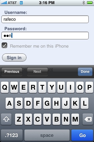
Apple made a clever user interface change with iPhone 2.0:

iPhone password masking

When you enter text into a password field, it briefly displays the character you just entered. After a few seconds, it changes the character into the mask, but it gives you some visible feedback that you’re entering the characters you think you’re entering. (I always had problems entering passwords correctly until this feature was added.)

It’s an acknowledgement that entering text using a virtual keyboard isn’t foolproof, and it provides a good compromise between masking passwords so people can’t see your password over your shoulder and enabling users to avoid typos when entering them.

By the way, this screen shot was taken using the new screen capture feature in iPhone 2.0.

Update: Commenters have noted that other phone makers have been doing it this way for years. I guess what this really means is that the iPhone is the first phone that I’ve ever used to enter a password.

What users do

As you know, I frequently mine the long term road test blog at Edmunds Inside Line for interesting tidbits that relate to design and user experience. Today I ran into a problem at work where people could no longer log into FogBugz because the computer running Windows XP on which it runs had decided that too many people were connected and I was violating the arbitrary rules Microsoft imposes to force you to purchase Windows Server 2003. Here’s the thing — nobody was actually using FogBugz at the time and the problem went away when I rebooted the server.

Then today I read about a complaint that the Edmunds staff have with Subaru’s navigation systems. Subaru disables the controls for navigation systems when the car is moving:

I find it extremely frustrating that some navigation systems, like the one found in our Subaru, will lock out 90% of the menu functions once the vehicle is in motion. Want to program in a new destination? Pull over and stop. Want to change the route from “quickest” to something more scenic? Pull over and stop. What if you’re mired in traffic, late, on a highway with no shoulder, or simply want to keep going? Tough.

And this remains the case whether you have a perfectly capable passenger riding shotgun next to you to press the buttons or not. A passenger can read regular maps while underway, and AAA gives them away to members for free. Tell me why I should pay one or two grand for one of these, again?

So what do users do when confronted with these arbitrary, user-hostile restrictions? They hack around them:

But our 2008 Subaru WRX STI has a hand-operated parking brake handle, a type that is much easier to control. While doing a hand-brake turn while horsing-around on the safe confines of a dry lake, I inadvertently found that pulling up on it doesn’t simply illuminate the brake lamp. Doing so also energizes all of the navigation system menus.

In the end, he winds up jamming his iPod under the parking brake handle so that he can use the navigation system whenever he likes. In the case of our FogBugz server, I’m going to uninstall Windows XP and replace it with some Linux variant as soon as I get a chance.
© 2024 rc3.org

Theme by Anders NorenUp ↑